JP Morgan Investment Relations Platform
Regulated Industries
Compliance
WCAG
End-To-End Design
Multiple User Types
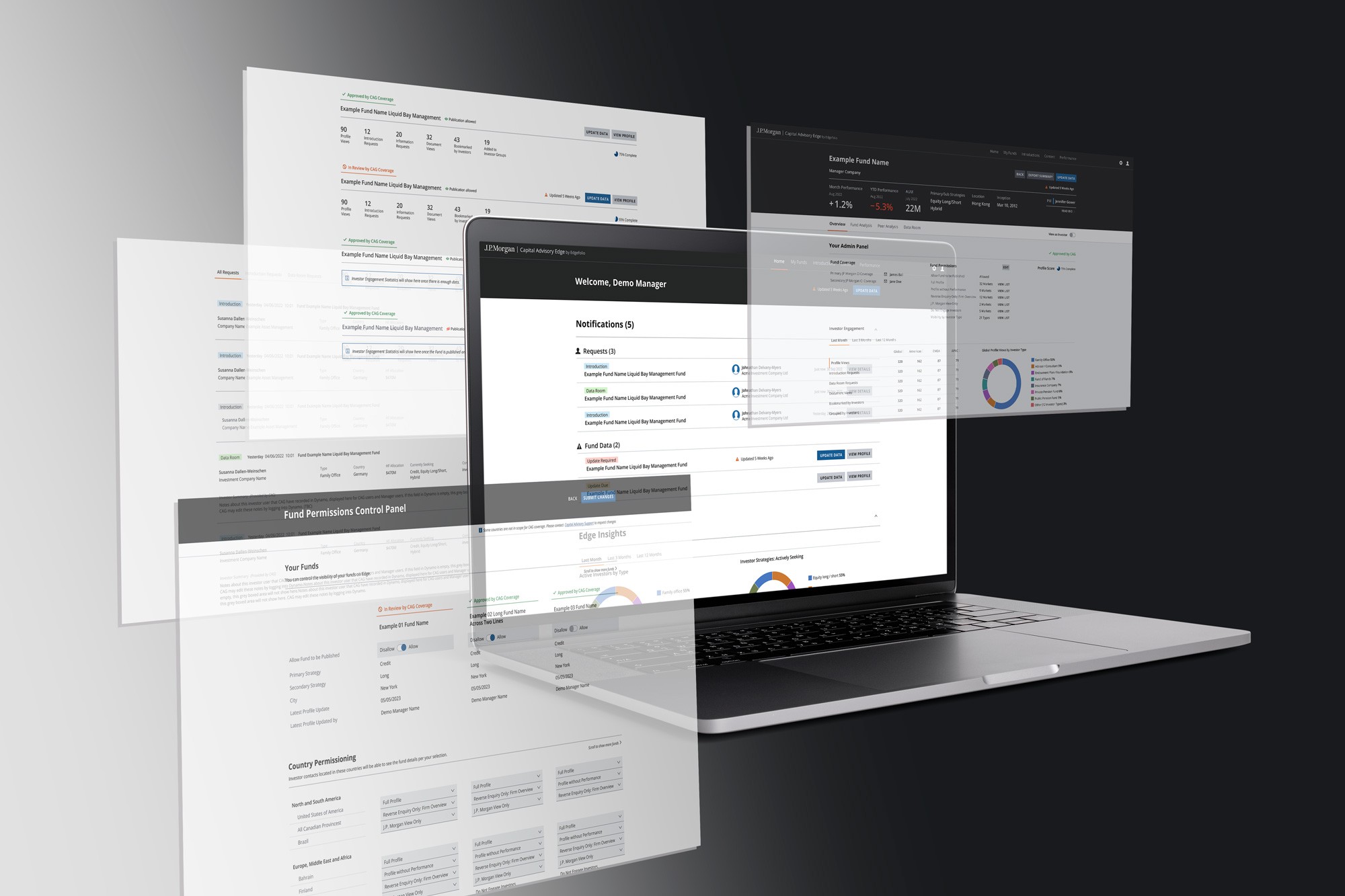
This project involved designing the first online platform for the Prime Brokerage Team of JP Morgan that connects Fund Managers with Fund Investors. The platform needed to support three core user types, enabling each to manage relationships and workflows compliantly across jurisdictions.
I led the UX and UI design process from discovery to delivery, collaborating with stakeholders across departments and integrating an existing design system into a high-fidelity, interactive prototype. Our north star: to evolve a traditionally high-touch, offline service into an intuitive, secure, and scalable digital experience—without losing the nuance of personal relationships that define this space.
Discover & Understand
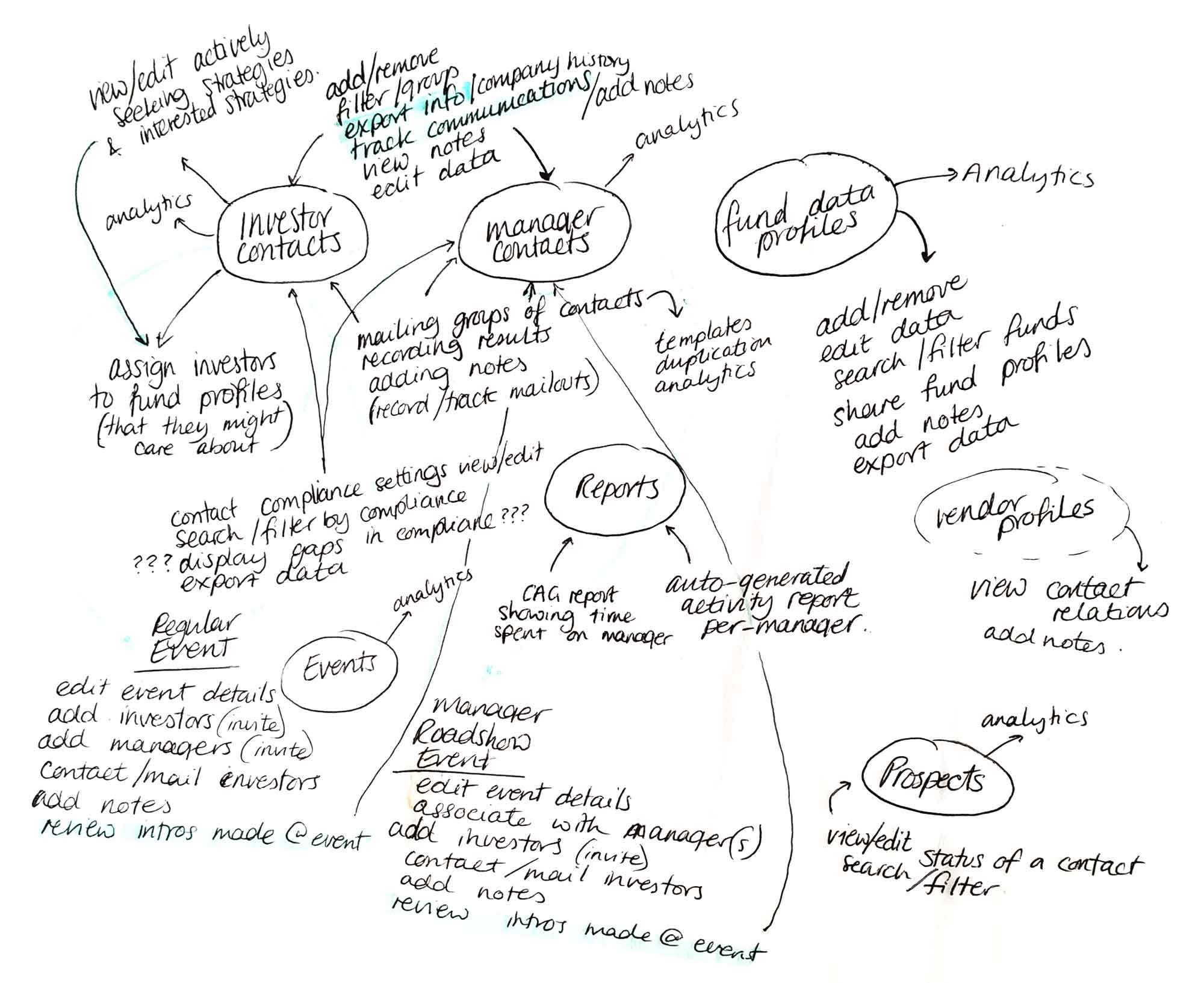
The initial brief came in the form of an extensive contract, outlining functional requirements at a technical level. My first challenge was to translate this contractual language into human-centred design goals.
Working closely with the Project Manager, we ran stakeholder workshops to:
- Understand the goals of the business and constraints imposed by global compliance requirements
- Map out the needs and expectations of the three user groups
- Audit the current service model and associated offline workflows
We also reviewed the existing internal platform the client wanted to evolve from, identifying elements worth preserving and areas requiring rethinking.
A major insight: the Advisory Team itself was both a service provider and a platform user. Designing for them meant enabling new digital workflows without disrupting existing client service.
Define the Strategy
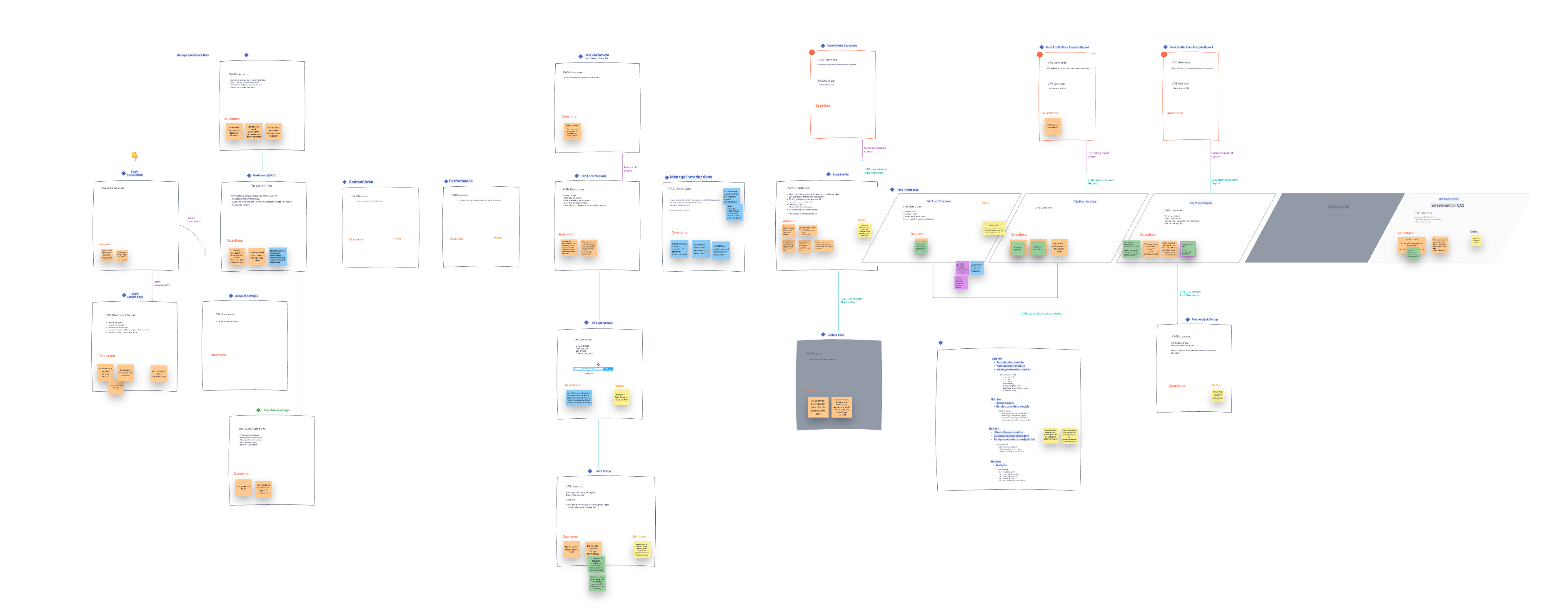
We arranged a series of workshops with the Advisory Team’s key stakeholders to define:
- Key user journeys for each persona
- Compliance-critical interactions that had to remain auditable and secure
- Workflow integrations needed to reflect how the Advisory Team currently managed investor-fund relationships manually
This phase resulted in a set of prioritised, user-centric objectives, grounded in real needs but structured to match delivery phases. It also clarified where bespoke design patterns were needed versus where we could leverage the client's design system.
Explore & Create
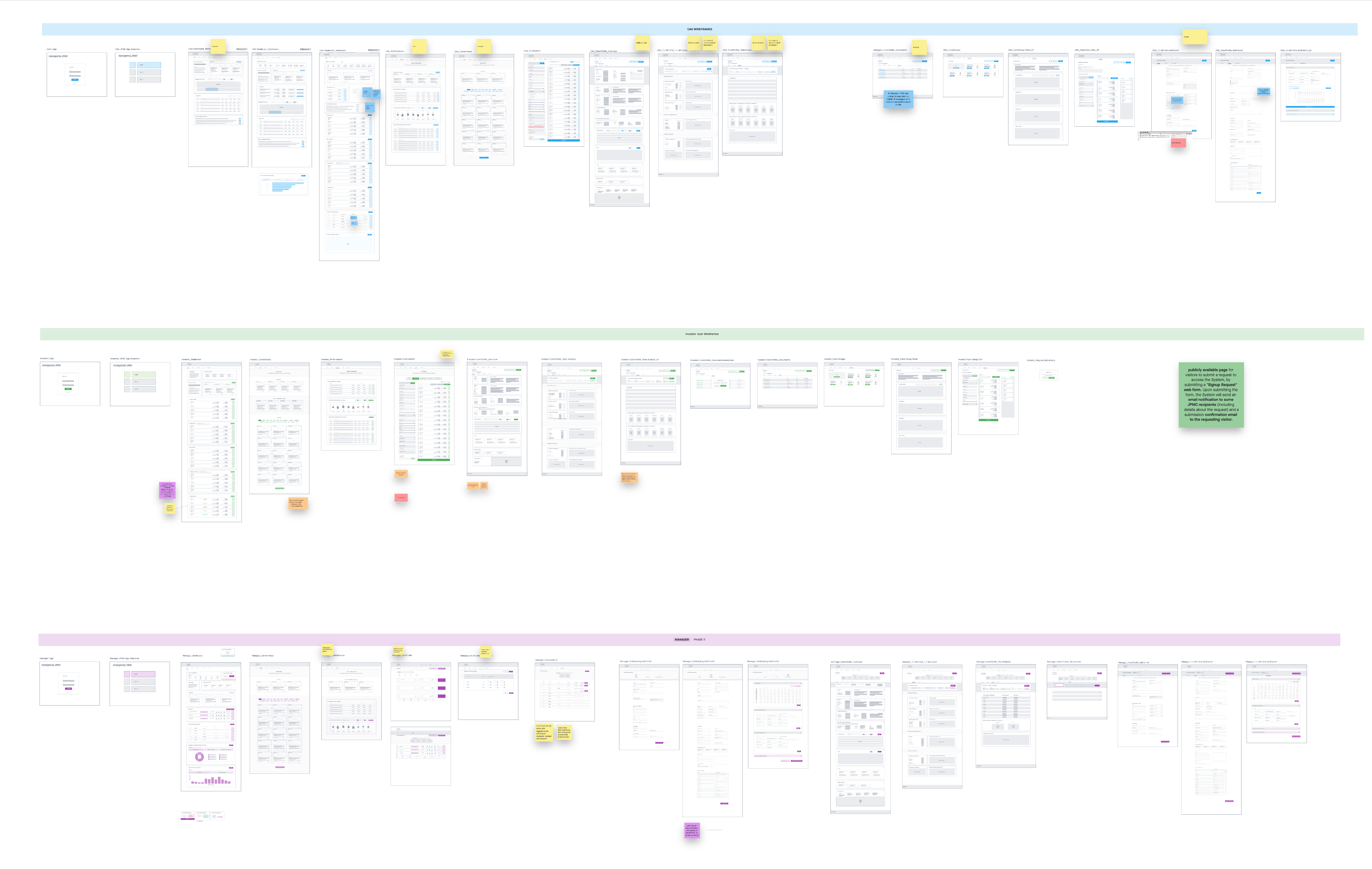
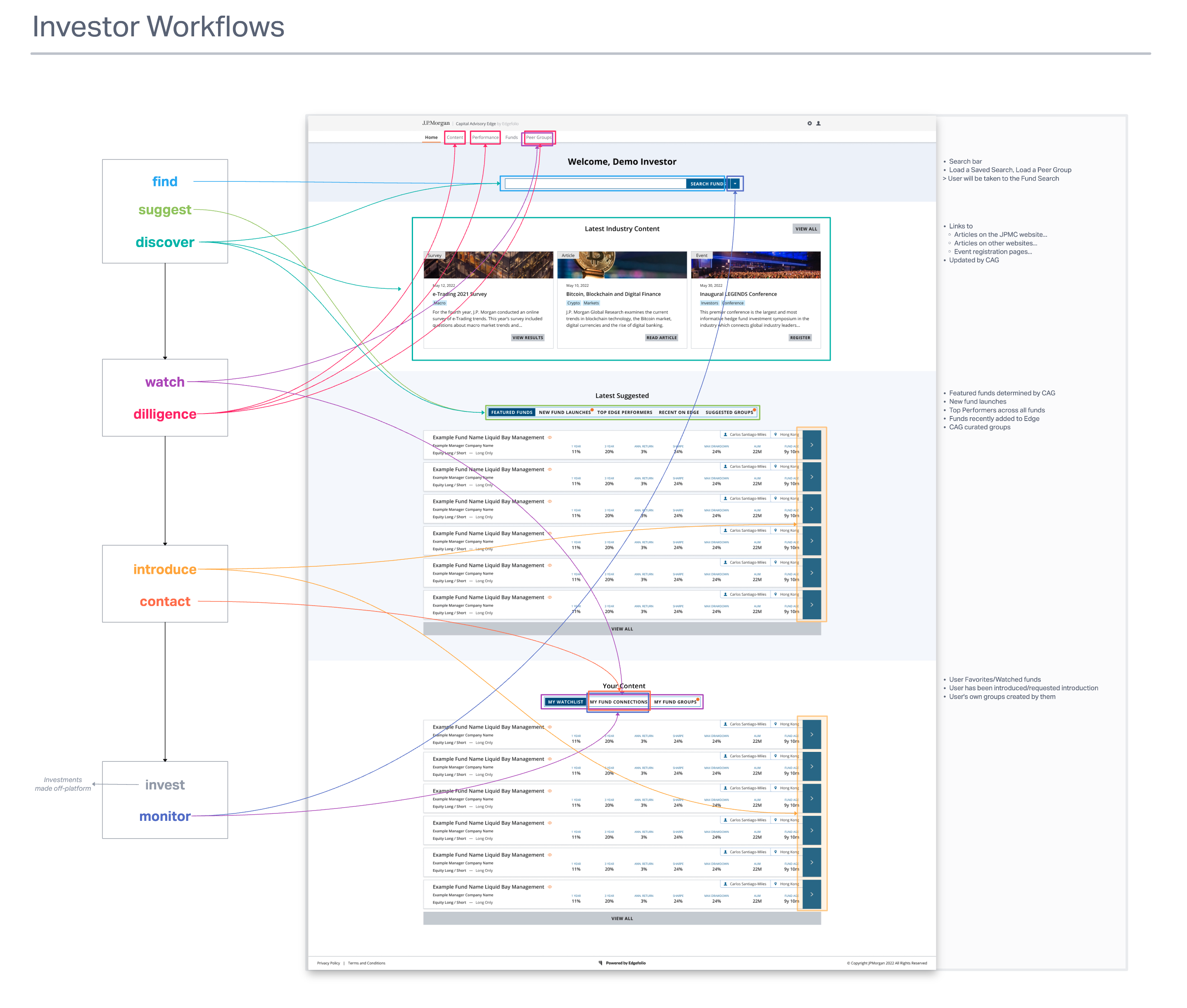
From this foundation, I began sketching and wire framing the full platform architecture, covering:
- Onboarding and profile setup
- Fund discovery and recommendations
- Relationship management flows for the Advisory Team
- Document handling and compliance checkpoints
We ran design reviews with the Advisory Team after each iteration of wireframes, ensuring we stayed aligned with internal workflows and terminology.
Design & Deliver
Once we had wireframes validated, I moved into high-fidelity UI design using the client’s internal design system. I collaborated with their UI team to:
- Maintain consistency with their broader brand language
- Extend the design system where necessary with new, reusable components
- Ensure WCAG accessibility compliance and responsive behaviour across devices
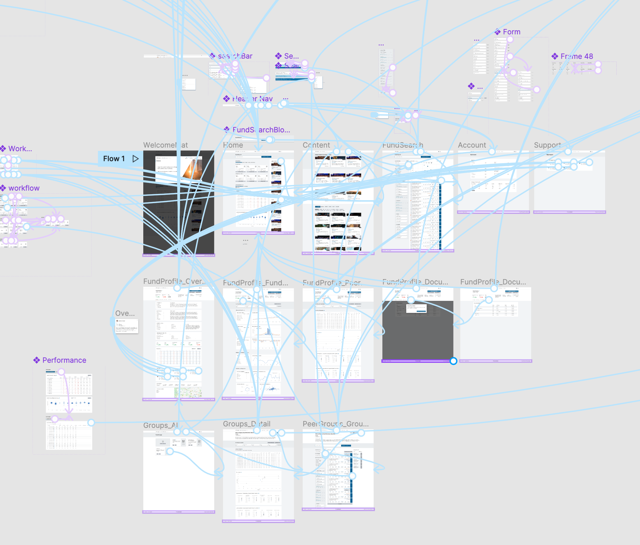
Using these designs, I built an interactive prototype in Figma, used in:
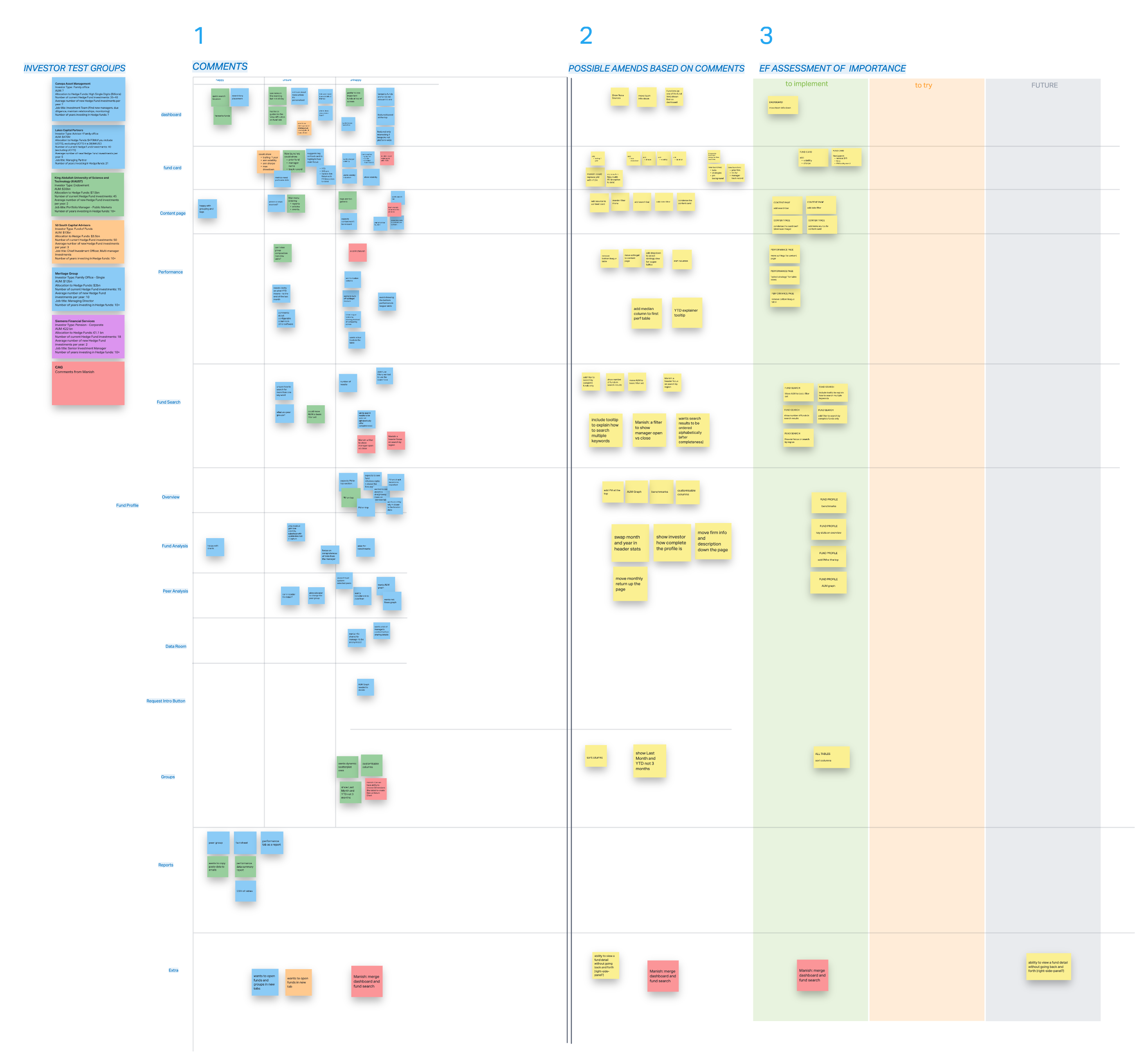
- Task-based user testing sessions with Investors
- Live feedback interviews, observing how users navigated key flows and interpreted UI language
These sessions directly informed several rounds of iteration, balancing usability with business and legal constraints.
Outcomes & Reflections
We delivered a platform design that:
- Met the needs of three complex user types
- Integrated legacy workflows while enabling digital-first efficiency
- Scaled across global jurisdictions and compliance protocols
- Reflected the Advisory Team’s nuanced, relationship-driven service model
A key challenge emerged during development: feedback loops became increasingly complex as stakeholders from different global regions began contributing late-stage input. This impacted our ability to lock designs, highlighting the need for better feedback governance and stakeholder alignment strategies in future engagements.
Get in touch
JP Morgan Investment Relations Platform
Regulated Industries
Compliance
WCAG
End-To-End Design
Multiple User Types
This project involved designing the first online platform for the Prime Brokerage Team of JP Morgan that connects Fund Managers with Fund Investors. The platform needed to support three core user types, enabling each to manage relationships and workflows compliantly across jurisdictions.
I led the UX and UI design process from discovery to delivery, collaborating with stakeholders across departments and integrating an existing design system into a high-fidelity, interactive prototype. Our north star: to evolve a traditionally high-touch, offline service into an intuitive, secure, and scalable digital experience—without losing the nuance of personal relationships that define this space.

Discover & Understand
The initial brief came in the form of an extensive contract, outlining functional requirements at a technical level. My first challenge was to translate this contractual language into human-centred design goals.
Working closely with the Project Manager, we ran stakeholder workshops to:
- Understand the goals of the business and constraints imposed by global compliance requirements
- Map out the needs and expectations of the three user groups
- Audit the current service model and associated offline workflows
We also reviewed the existing internal platform the client wanted to evolve from, identifying elements worth preserving and areas requiring rethinking.
A major insight: the Advisory Team itself was both a service provider and a platform user. Designing for them meant enabling new digital workflows without disrupting existing client service.

Define the Strategy
We arranged a series of workshops with the Advisory Team’s key stakeholders to define:
- Key user journeys for each persona
- Compliance-critical interactions that had to remain auditable and secure
- Workflow integrations needed to reflect how the Advisory Team currently managed investor-fund relationships manually
This phase resulted in a set of prioritised, user-centric objectives, grounded in real needs but structured to match delivery phases. It also clarified where bespoke design patterns were needed versus where we could leverage the client's design system.

Explore & Create
From this foundation, I began sketching and wire framing the full platform architecture, covering:
- Onboarding and profile setup
- Fund discovery and recommendations
- Relationship management flows for the Advisory Team
- Document handling and compliance checkpoints
We ran design reviews with the Advisory Team after each iteration of wireframes, ensuring we stayed aligned with internal workflows and terminology.


Design & Deliver
Once we had wireframes validated, I moved into high-fidelity UI design using the client’s internal design system. I collaborated with their UI team to:
- Maintain consistency with their broader brand language
- Extend the design system where necessary with new, reusable components
- Ensure WCAG accessibility compliance and responsive behaviour across devices
Using these designs, I built an interactive prototype in Figma, used in:
- Task-based user testing sessions with Investors
- Live feedback interviews, observing how users navigated key flows and interpreted UI language
These sessions directly informed several rounds of iteration, balancing usability with business and legal constraints.


Outcomes & Reflections
We delivered a platform design that:
- Met the needs of three complex user types
- Integrated legacy workflows while enabling digital-first efficiency
- Scaled across global jurisdictions and compliance protocols
- Reflected the Advisory Team’s nuanced, relationship-driven service model
A key challenge emerged during development: feedback loops became increasingly complex as stakeholders from different global regions began contributing late-stage input. This impacted our ability to lock designs, highlighting the need for better feedback governance and stakeholder alignment strategies in future engagements.
Get in touch
Experience
Work
Contact
JP Morgan Investment Relations Platform
Regulated Industries
Compliance
WCAG
End-To-End Design
Multiple User Types
This project involved designing the first online platform for the Prime Brokerage Team of JP Morgan that connects Fund Managers with Fund Investors. The platform needed to support three core user types, enabling each to manage relationships and workflows compliantly across jurisdictions.
I led the UX and UI design process from discovery to delivery, collaborating with stakeholders across departments and integrating an existing design system into a high-fidelity, interactive prototype. Our north star: to evolve a traditionally high-touch, offline service into an intuitive, secure, and scalable digital experience—without losing the nuance of personal relationships that define this space.

Discover & Understand
The initial brief came in the form of an extensive contract, outlining functional requirements at a technical level. My first challenge was to translate this contractual language into human-centred design goals.
Working closely with the Project Manager, we ran stakeholder workshops to:
- Understand the goals of the business and constraints imposed by global compliance requirements
- Map out the needs and expectations of the three user groups
- Audit the current service model and associated offline workflows
We also reviewed the existing internal platform the client wanted to evolve from, identifying elements worth preserving and areas requiring rethinking.
A major insight: the Advisory Team itself was both a service provider and a platform user. Designing for them meant enabling new digital workflows without disrupting existing client service.

Define the Strategy
We arranged a series of workshops with the Advisory Team’s key stakeholders to define:
- Key user journeys for each persona
- Compliance-critical interactions that had to remain auditable and secure
- Workflow integrations needed to reflect how the Advisory Team currently managed investor-fund relationships manually
This phase resulted in a set of prioritised, user-centric objectives, grounded in real needs but structured to match delivery phases. It also clarified where bespoke design patterns were needed versus where we could leverage the client's design system.

Explore & Create
From this foundation, I began sketching and wire framing the full platform architecture, covering:
- Onboarding and profile setup
- Fund discovery and recommendations
- Relationship management flows for the Advisory Team
- Document handling and compliance checkpoints
We ran design reviews with the Advisory Team after each iteration of wireframes, ensuring we stayed aligned with internal workflows and terminology.


Design & Deliver
Once we had wireframes validated, I moved into high-fidelity UI design using the client’s internal design system. I collaborated with their UI team to:
- Maintain consistency with their broader brand language
- Extend the design system where necessary with new, reusable components
- Ensure WCAG accessibility compliance and responsive behaviour across devices
Using these designs, I built an interactive prototype in Figma, used in:
- Task-based user testing sessions with Investors
- Live feedback interviews, observing how users navigated key flows and interpreted UI language
These sessions directly informed several rounds of iteration, balancing usability with business and legal constraints.


Outcomes & Reflections
We delivered a platform design that:
- Met the needs of three complex user types
- Integrated legacy workflows while enabling digital-first efficiency
- Scaled across global jurisdictions and compliance protocols
- Reflected the Advisory Team’s nuanced, relationship-driven service model
A key challenge emerged during development: feedback loops became increasingly complex as stakeholders from different global regions began contributing late-stage input. This impacted our ability to lock designs, highlighting the need for better feedback governance and stakeholder alignment strategies in future engagements.
Get in touch
Experience
Work
